Why Cheetos designed the world’s worst font.
We’ve seen brands turn their logos into font alphabets for fans to use across different platforms.
Cheetos, however, has taken a different approach inspired by the signature orange dust that sheds with every grab.
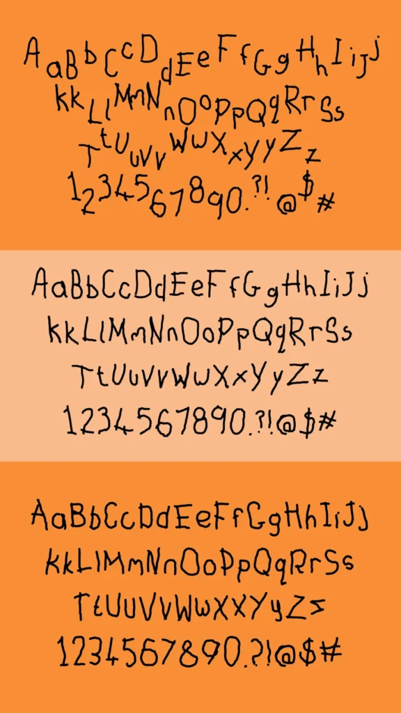
Rather than designing a typeface based on its recognisable logo, the snack brand has introduced ‘Other Hand’ font.
Marking National Handwriting Day the idea is based on data that 99% of customers eat Cheetos (including font designers) with their dominant hand.
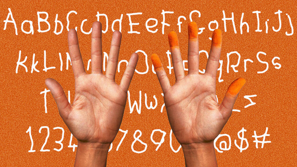
The font is available to download or use via a browser extension, and in a promotional video, designers from ad agency SG&P demonstrate the process, their fingers stained orange as they talk about the inspiration behind it.
Rich Silverstein designed the font alongside his team at Silverstein Goodby & Partners, “It’s a testament to the countless hours spent crafting every detail. Doing it all with our non-dominant hand was an experience we’ll never forget.”
Cheetos has always leaned into the fun, messy side of snacking now they’ve just found a way to turn that into a font.