Burger King kicks of the new year with its first major rebrand in 20 years
Burger King is kicking off the new year with a new look, introducing its first rebrand in 20 years.
The fast food chain is ringing in 2021 with a retro-inspired identity, designed by the agency Jones Knowles Ritchie.
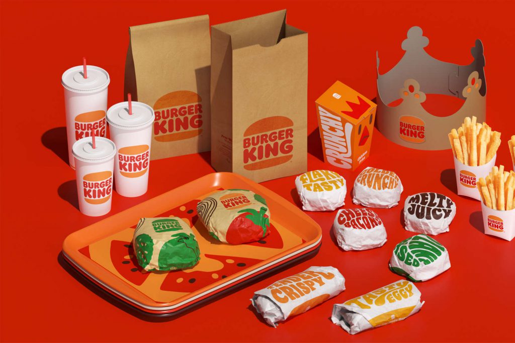
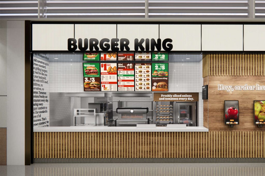
The company has unveiled fresh visual designs, restaurant concepts including new logos, colours, fonts, uniforms, even packaging.
Restaurant Brands International Head of Design Raphael Abreu said in a statement.”Design is one of the most essential tools we have for communicating who we are and what we value, and it plays a vital role in creating desire for our food and maximising guests’ experience.”
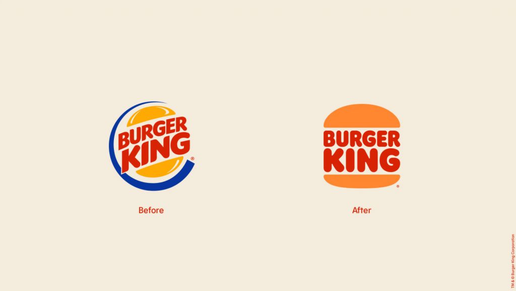
They’ve moved away from the 1999 logo with an updated riff on the 1969 and 1994 versions that reads “Burger King” squished between the buns.
“We wanted to use design to get people to crave our food; its flame-grilling perfection and above all, its taste.”
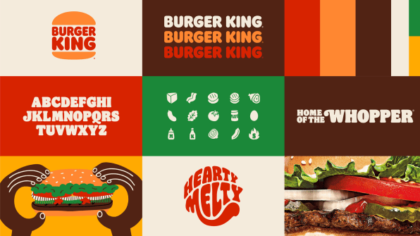
According to the statement, Burger King is focused on capturing the brand’s key characteristics— big and bold, playfully irreverent with this new aesthetic, which will also include changes to menus, decor and signage, social media assets, and restaurant merch.
“Inspired by real and delicious food, the more modern look marks the first complete rebrand in over 20 years and will more authentically represent Burger King values,” the company said.
“The announcement signals a commitment to digital-first expression and recent improvements to taste and food quality, through the removal of colors, flavors, and preservatives from artificial sources from menu items, as well as an ambitious pledge to environmental sustainability.”