The picture of ill-health: Pantone launches new campaign to highlight world water crisis
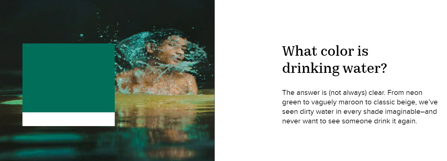
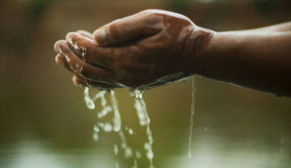
Pantone have launched a campaign to highlight the fact that 1 in 10 people are living without access to clean and safe water. Partnering with Charity: Water, the paint behemoth has launched a rather harrowing rainbow of colours, each with its own backstory. The colors were inspired by drinking water found in communities around the world.
For example, when taken to the Pantone website, you are greeted by a palette of varying colours. When you click on say, yellow, you are taken to the story of Tencia, a baker. To her, clean water means a chance to grow her business. “My dream? I want to have a huge field and a big house,” she shared proudly. Equally, when you click on green, you are greeted by Ram- someone who worked tirelessly to bring clean water to his community in India. Pantone speaks of how over the course of a decade, it completely transformed—and so did Ram.
From neon green to vaguely maroon to classic beige, Pantone claim that they’ve seen dirty water in every shade imaginable–and never want to see someone drink it again. The end of the piece therefore takes you to a page full of information telling you where you can donate and how. As pioneers of colour and all its beauty and variation, its not surprising that Pantone are keen to exhibit the emotional connotations of colour and how we can use it as a conduit for spreading crucial messages.
Read more here: https://www.charitywater.org/uk/dirtywater?utm_source=bp-us&utm_medium=social&utm_term=pantone&utm_content=&utm_campaign=wwd&color=green